
How can we improve graphics?
- Ensure a consistent typography
Text is one of the main elements of a website. Using the right fonts when creating texts is crucial to their appearance. Ensure your site has at least two or three font types. There is an impression of clutter and inconsistency when more typefaces are used. Additionally, it gives the impression of carelessness and randomness. For headers, choose one font type, and for longer texts, choose another.

- White Space
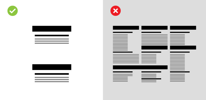
A visually appealing website is readable and orderly. Utilizing white space is a good way to achieve a professional and readable effect. The parts of the site (and graphic designs in general) contain only the background.
In this way, the site sections can be "breathed" between one another. In addition to being easier to read, white space on a site is also more pleasing. Sites need to be easy to read and well organized to be visually appealing. Apple designers, who have been applying the WS principle on their websites for decades, are masters of this solution.
Examine your site critically and see if it is not too tight in some places and if the amount of content is not overwhelming. Separate these areas with white space if there are any. Begin with headers and paragraphs. The title should be placed above the paragraph with more space between them.
- Colour scheme of the site
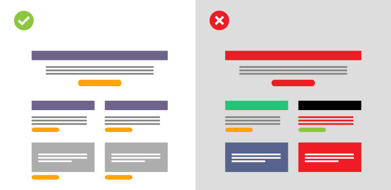
Ensure that the colour scheme of your site is well thought out. Having too many colours is bad, just as it is with fonts. All headers, paragraphs, and buttons should have the same colour. You should make sure that all headers of the same type are blue on your site if you want the headers to be blue. If the background makes reading difficult in some places (e.g. if it's blue), then you can create a white or another legible heading. The number of them should not be too high.
Text in paragraphs should be one colour. Black is always a good choice. Use a different colour to highlight some text, but remember to do so in moderation. Highlighting only works when it separates an element from its environment. The highlighted text is more difficult to read if everything around it is rainbow-coloured.
- How to choose the right photos
Adding photos to your website can make it more appealing. Beautiful pictures are something we all enjoy. Make sure your photos match your website. Try to make your next photo look similar to the previous one if your previous ones were more minimalist.
Do not use stock photos with a lot of popularity. Many sites host these images and some of them are very popular. A stock photo can become a meme if its characters appear in it. Don't use them to avoid being ridiculed. Try to select photos that are original to convey the feeling of professionalism.
- Breaking down long texts and line spacing
Most people don't know that the readability of a text is influenced by the size of line spacing, i.e. the distance between individual lines of text. Increasing the line spacing will ensure easy reading. At least 150% of the letter height should be left between lines, with a line containing 40-80 characters (including spaces).

Another important step is to break long paragraphs up into several smaller ones. Reading the text becomes easier and more enjoyable. It is best to read paragraphs with no more than 10 lines. You should keep in mind that people scan the Internet more than they read it. Make it easier for them, and they will be more likely to get acquainted with what you want to convey.
- Use icons
You should use graphics to diversify the look of your web page if your page has a lot of text. Symbols or icons may be used as such images. Eye-catching elements such as icons are very effective. They are perfect for accompanying headers or drawing attention to a paragraph of text.

Your online store might describe delivery options using an icon of a courier truck or a parcel. When asking for contact information, you can show an icon such as an envelope or phone next to it. Due to its easy recognition, the user will be able to locate relevant content more quickly.
- Favicon, or your icon
An icon appears in the browser's tab as the Favicon. You can find your site more easily with the distinctive image among open tabs. If you have not yet created a favicon for your site, you should. You can easily do this to improve the look of your website.
- Create sections for each sub-page
Text walls bore no one. You should ensure your users can find the fragments that interest them. By breaking down long, drawn-out passages into smaller, easily distinguishable sections, the task will be much easier. Organize the text with headers and portion it into manageable chunks.

Your site will You must keep more user-friendly by following these steps. Sections should have vibrant backgrounds to make divisions clear and legible. Use visually appealing objects to differentiate the sections of the site. Images and photos will work well here. In addition, you can make your site appear more divided by large headers
- Use images as a background
Your website will take on some character if you add images, textures, or patterns as a background. You can use a photo or a repeating graphic motif. In text-based sites, a subtle pattern or blurry photo will make them more eye-catching and keep the user's attention longer. In places where you want the reader to be able to distinguish them more clearly, this method works perfectly.

- It's better to have less
Lastly, a very important general advice. Instead of focusing on the quantity of content, focus on its quality. The user is more likely to be attracted to a clear, readable message than to a long, elaborate text. Just say as much as necessary on the site, don't try to "talk" too much. Your site will be used by most users on their smartphones. You won't be able to fit in a lot of text on it, and as a result, your guests might leave.
Overview
You will be able to see the visual effect of these changes almost immediately. They should reasonably take a few hours to perform. It is important that you keep your site updated at all times. Things that seem to need no changes right now, but might need to be altered soon, according to you. You should also visit your site often and evaluate it critically, taking into consideration the persona of a typical user. Improve, experiment, try.

Feel free to ask me any questions you might have